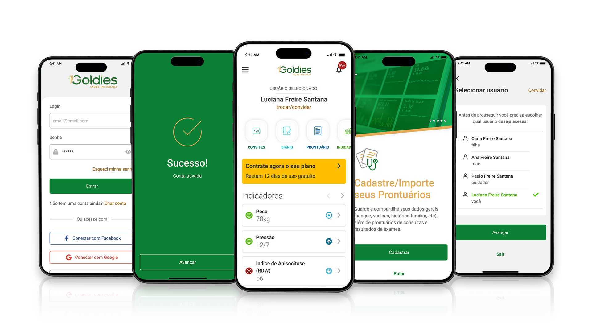
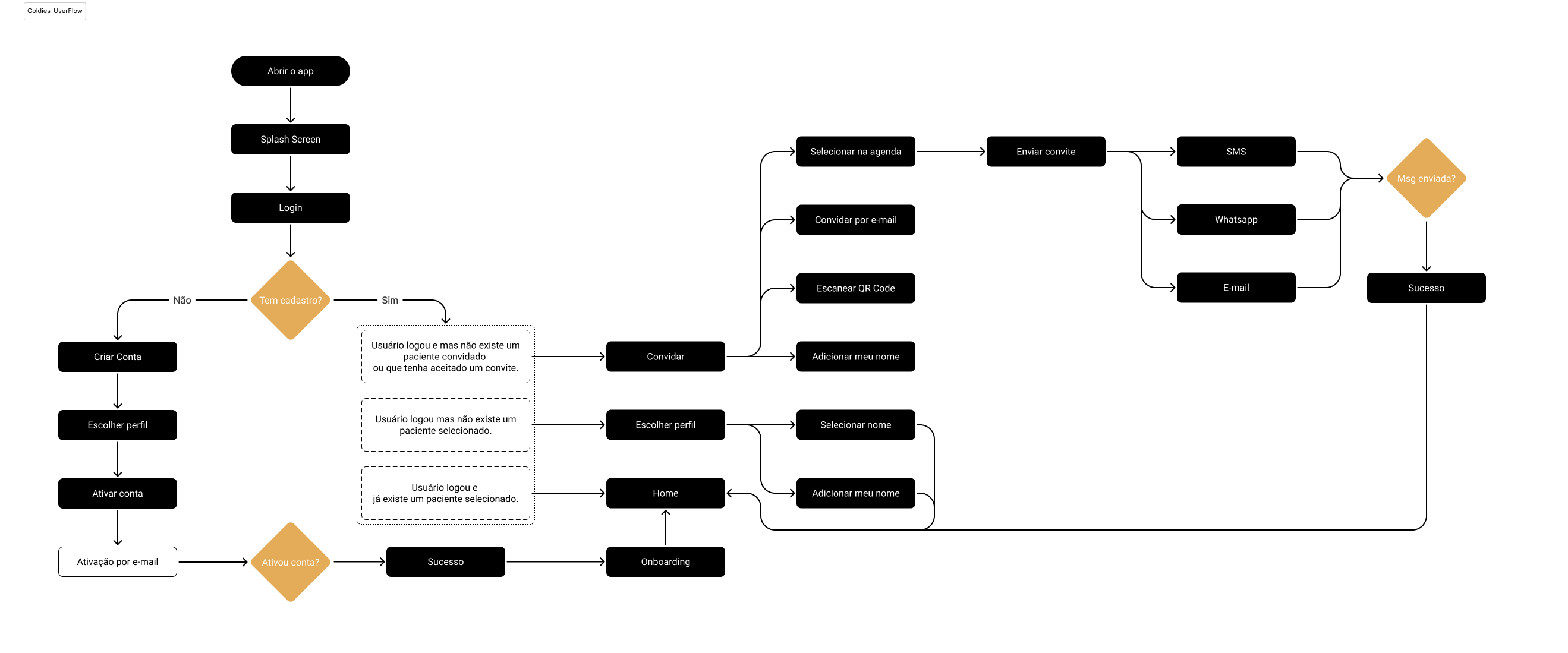
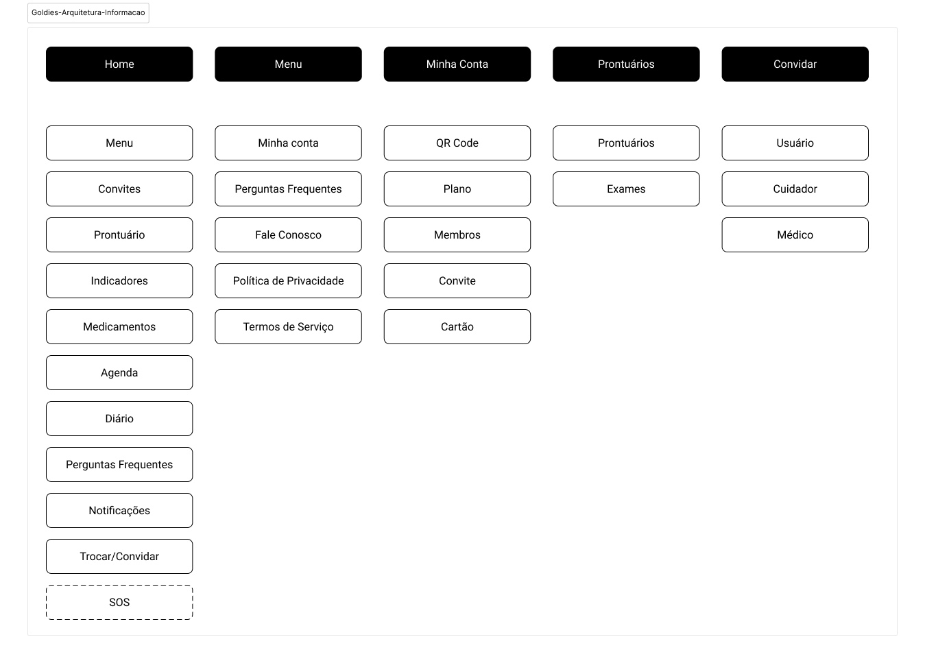
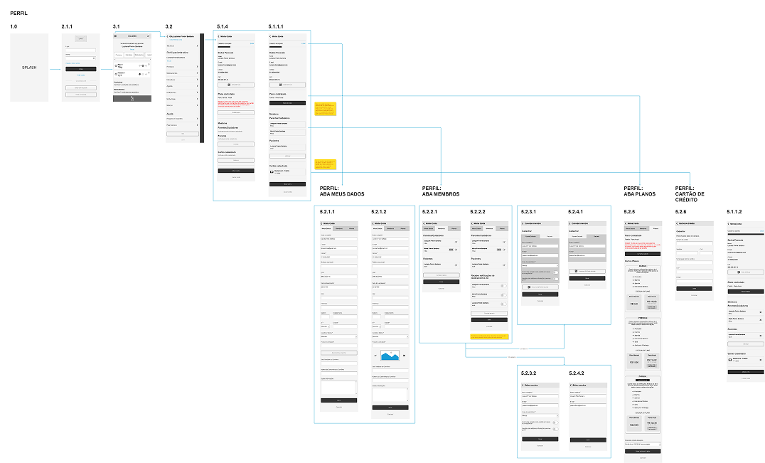
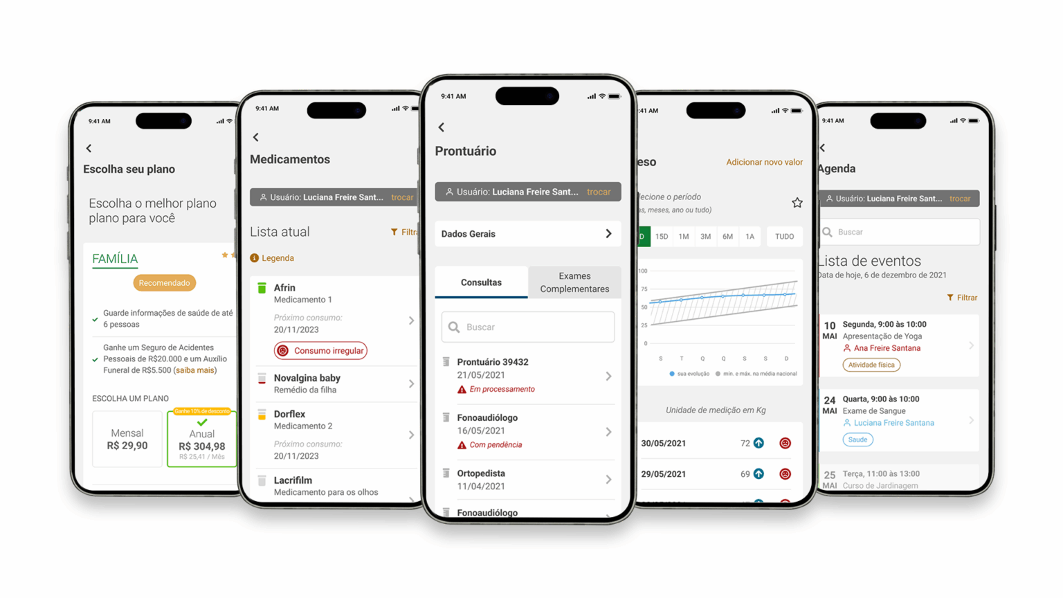
Just a few months after launch, the app reached hundreds of downloads and received a lot of positive feedback from users and healthcare professionals, who highlighted its convenience and direct impact on family routines. Features such as exam/record storage, medication tracking, indicator monitoring and information sharing with family members and doctors contributed to adherence to the concept of collaborative, remote care, in addition to enabling greater efficiency in medical appointments. The project brings together technology, empathy and usability in service of more humane, integrated health management.
Goldies Integrated Health is a Brazilian healthtech born with the purpose of making it easier to care for families' health and well-being. Its app centralizes medical information — such as records, exams, medication schedules and health indicators — and allows this data to be shared with family members, caregivers and doctors. The platform promotes self-care and brings people closer together, offering an intuitive and secure digital solution that helps from childhood monitoring to elderly care, turning health management into something simple, accessible and connected.
The challenge was to create an app that would allow different profiles — users, family members, caregivers and doctors — to care for the health and well-being of families, especially the elderly, in a simple and connected way. The solution needed to integrate several features, such as registration of multiple users with customizable permissions, secure storage of medical records and exams, automatic generation of health indicators, medication management with smart reminders, an integrated appointments calendar, a personal diary, plus an emergency (SOS) button for critical situations. We needed a fluid, accessible experience, with an intuitive interface and empathetic visual language, capable of serving everyone from young caregivers to elderly users, ensuring clarity, security and ease when sharing information.
My work as UX/UI Designer was essential to turning Goldies' strategic vision into a functional, accessible and empathetic digital experience. I took part in every stage of the project — from gathering requirements and understanding the pain points of the different user profiles to structuring flows, information architecture and defining the interfaces. I worked to balance technology and sensitivity, ensuring the app was intuitive even for elderly users, without losing the visual sophistication and clarity a health product needs. Through interactive prototypes and usability testing, I sought to validate solutions that would genuinely make users' day-to-day easier, turning family health care into something simple, secure and integrated.
Research was carried out on competitors, apps and websites, with an initial analysis focused on direct and indirect competitors to understand their strategies, strengths and opportunities for improvement. Based on this investigation, market best practices were identified and learnings were extracted that contributed to refining the project.
71 years old
"I'm retired and I take care of my husband, who has diabetes. I want convenience and security to organize our exams and medications."
ABOUT ME
who am I? what do I do?
ABOUT MY ROUTINE
who do I live with? what are my habits? what's my day like?
MY PERSONALITY
MOTIVATIONS & HOBBIES
what are my interests? how do I spend my free time?
PAINS
What are my difficulties? What would I like to solve?
DESIRES
what are my needs? what results would I like to have?
I created a user flow that helps visualize, analyze and optimize the path a user takes to achieve a specific goal in a digital product. This diagram allows the design and development team to understand user needs, identify friction points and create a more intuitive and efficient experience.
Example:
This is the foundation that organizes and structures content logically, ensuring the user finds what they need intuitively and without effort. Without well-planned architecture, even the most attractive design can result in a frustrating experience.
While creating the wireframes I focused on functionality, layout and content organization rather than aesthetics — the wireframes ensured the product's foundation was solid and user-centered.
I tested the usability of different flows through wireframes. These low-fidelity prototypes allowed us to validate interactions with users in the early stages of the project, focusing exclusively on functionality, flow and information architecture, without distractions from more elaborate visual elements.
Users navigated the app well but raised points that were analyzed and studied before being implemented.
| SUGGESTIONS | SOLUTIONS |
|---|---|
| Include more information about the app's features and possibilities. | After account activation during sign-up, users are now directed through a sequence of onboarding screens (Complete your registration, Invite to your plan, Fill in your General Data, Register/Import your Records, and Register your Medication). This way they absorb information about certain areas while filling in important data. |
| Include an option to share the app. | An app-sharing link was added to the app's menu, making it easier to send to friends and family. |
| Reduce the number of links in the "hamburger" menu. | Removed the categories from the app's menu. They're already available in the home screen carousel. |
I developed a design system for the Goldies app given the complexity and wide variety of screens, allowing me to ensure consistency and brand identity, efficiency and productivity, scalability in case the design system needs to expand, improved collaboration between teams, a focus on accessibility ensuring the product is inclusive and easy for people with different needs, and strategic decision-making (decisions focused on strategic aspects and the overall user experience rather than aesthetics).