Goldies Saúde Integrada
In just a few months after its launch, the app reached hundreds of downloads and received enthusiastic feedback from users and healthcare professionals, who highlighted its practicality and direct impact on family routines. Features such as exam and medical record storage, medication tracking, health indicator monitoring, and information sharing with relatives and doctors contributed to the adoption of the concept of collaborative and remote care. The project combines technology, empathy, and usability to promote a more human and integrated approach to health management.

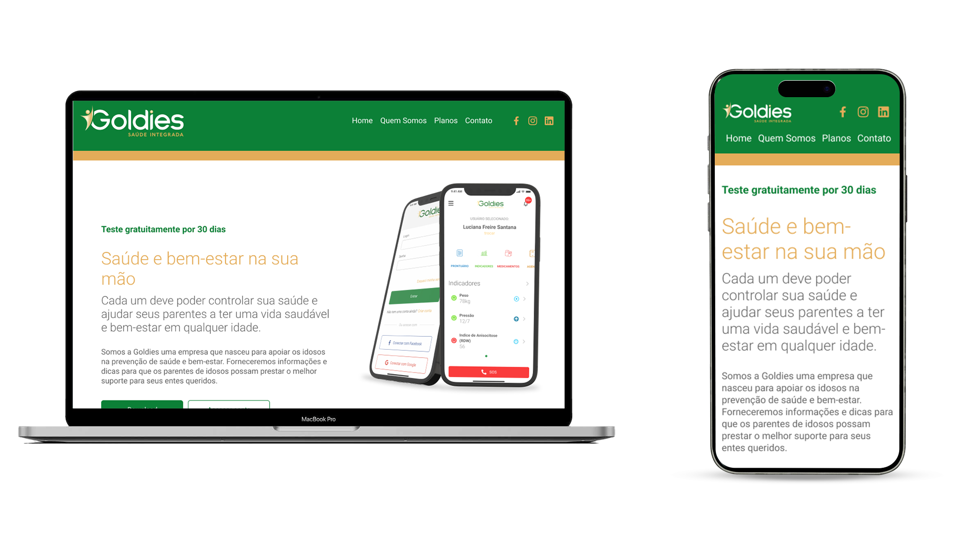
A Goldies Saúde Integrada is a Brazilian healthtech startup created with the mission of simplifying family health and well-being management. Its mobile app centralizes medical information — such as records, exams, medication schedules, and health indicators — and allows users to securely share these data with relatives, caregivers, and doctors. The platform encourages self-care and connection, offering an intuitive and secure digital solution that supports everyone from child monitoring to elderly care, transforming health management into something simple, accessible, and connected.
Challenge
The challenge was to create an app that would allow different user profiles — patients, family members, caregivers, and doctors — to manage family health and well-being, especially for the elderly, in a simple and connected way. The solution needed to integrate multiple features, such as multi-user registration with customizable permissions, secure medical record and exam storage, automatic health indicator generation, smart medication reminders, integrated appointment scheduling, a personal diary, and an emergency (SOS) button for critical situations. We aimed for a fluid and accessible experience with an intuitive interface and empathetic visual language, suitable for both young caregivers and elderly users — ensuring clarity, security, and ease in sharing information.

My Role
My role as a UX/UI Designer, was essential to transform Goldies’ strategic vision into a functional, accessible, and empathetic digital experience. I participated in every stage of the project — from gathering requirements and understanding the pain points of different user profiles to structuring flows, defining the information architecture, and designing interfaces. I worked to balance technology and sensitivity, ensuring that the app would be intuitive even for senior users, without compromising on visual sophistication and clarity — crucial aspects of a healthcare product. Through interactive prototypes and usability testing, I validated solutions that truly simplified users’ daily lives, making family health care easier, safer, and more connected.
Pesquisa
Competitive research was conducted across various apps and websites, with an initial focus on direct and indirect competitors to understand their strategies, strengths, and opportunities for improvement. This investigation helped identify market best practices and extract insights that contributed significantly to enhancing the project.
Persona
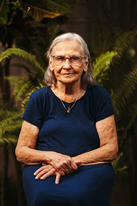
Maria Lúcia
71 years old
"I’m retired and take care of my husband, who has diabetes. I’m looking for practicality and safety to organize our exams and medications."
About Me
Who am I? What do I do?
- Belo Horizonte (MG)
- Retired, former teacher;
- Middle-class, regular internet and smartphone user;
- Medium familiarity with technology — uses WhatsApp, banking apps, and seeks simple health solutions;
- Married, two adult children living in different cities.
My Routine
Who do I live with? What are my habits? What is my daily routine like?
- Lives with her husband;
- Takes medication at regular times;
- Eats lunch but not dinner — prefers soup;
- Uses WhatsApp to chat with family and friends;
- Watches videos regularly.
Personality
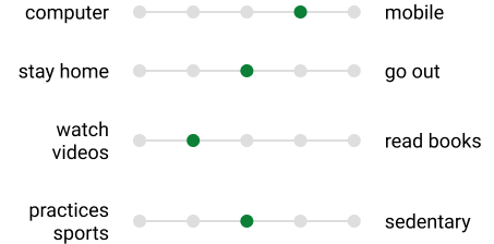
Motivations & Hobbies
What are my interests? How do I spend my free time?
- Enjoys walking;
- Practices water aerobics;
- Watches TV;
- Uses her phone often;
- Values rest and calm routines.
Pain Points
What are my difficulties? What would I like to solve?
- Difficulty storing and finding old or digitalized exams;
- Forgetting medication times and refills;
- Lack of communication between doctors and family members about patient progress;
- Fear of losing personal data and initial distrust of digital security.
Goals & Needs
What are my needs? What results would I like to achieve?
- Feel in control of her own and her family’s health;
- Reduce anxiety and the burden of caregiving;
- Trust a safe and easy-to-use solution that truly improves her routine.
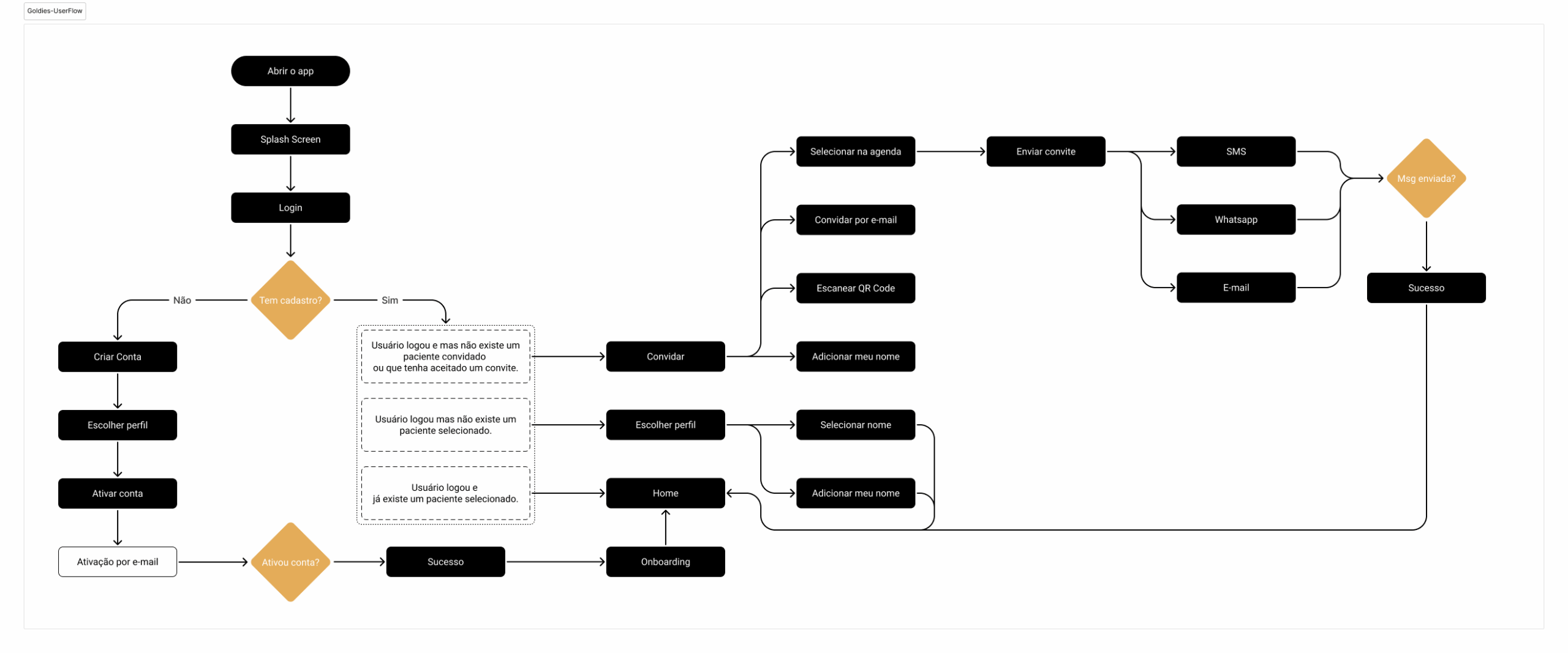
User Flow
I created a user flow to visualize, analyze, and optimize the path the user takes to achieve specific goals within the product. This diagram helped the design and development teams understand user needs, identify friction points, and create a more intuitive and efficient experience.
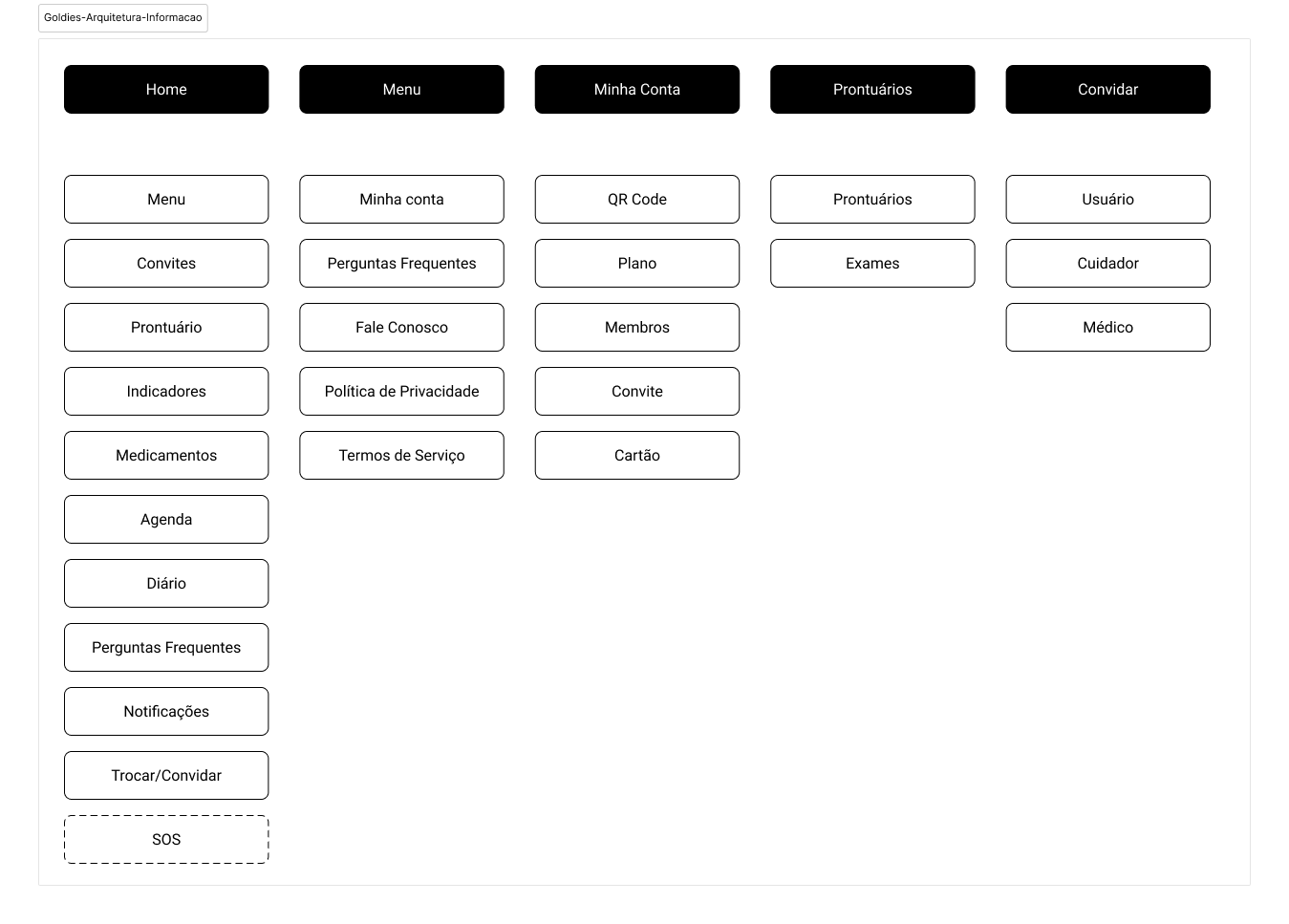
Information Architecture
Information Architecture organizes and structures content logically, ensuring users can find what they need effortlessly. Without a well-planned architecture, even the most visually appealing design can result in a frustrating experience.
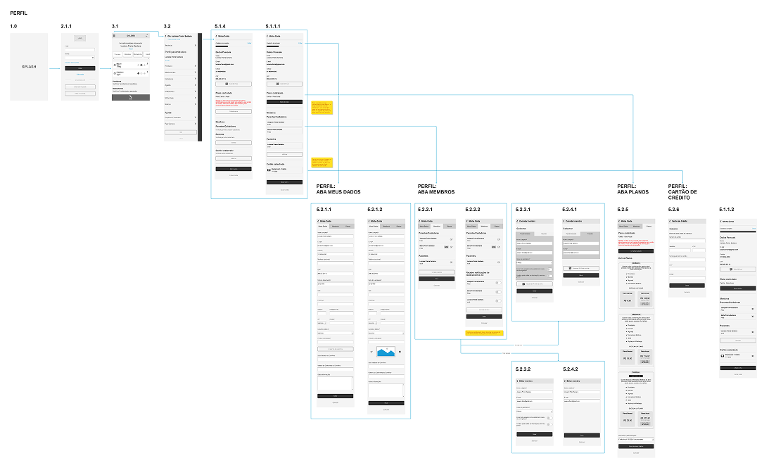
Wireframes
When creating wireframes, I focused on functionality, layout, and content organization rather than aesthetics. Wireframes ensured that the product’s foundation was solid and user-centered.
Usability Testing
I tested the usability of different flows through wireframes. These low-fidelity prototypes allowed for early validation of interactions with users, focusing exclusively on functionality, flow, and information architecture — without distractions from detailed visuals.
Users navigated the app smoothly but provided valuable feedback that was analyzed and implemented later.
| SUGGESTIONS | SOLUTIONS |
|---|---|
| Add more information about app features and possibilities. | After account activation, users are now guided through a sequence of onboarding screens (Complete Your Profile, Invite Family Members, Fill in General Information, Add/Import Medical Records, Register Medications). This helps them learn about key sections while entering relevant data. |
| Include an option to share the app. | A “Share App” link was added to the main menu, making it easier for users to send it to friends and family. |
| Reduce the number of links in the hamburger menu. | App menu categories were removed, as they are already accessible from the carousel on the home screen. |
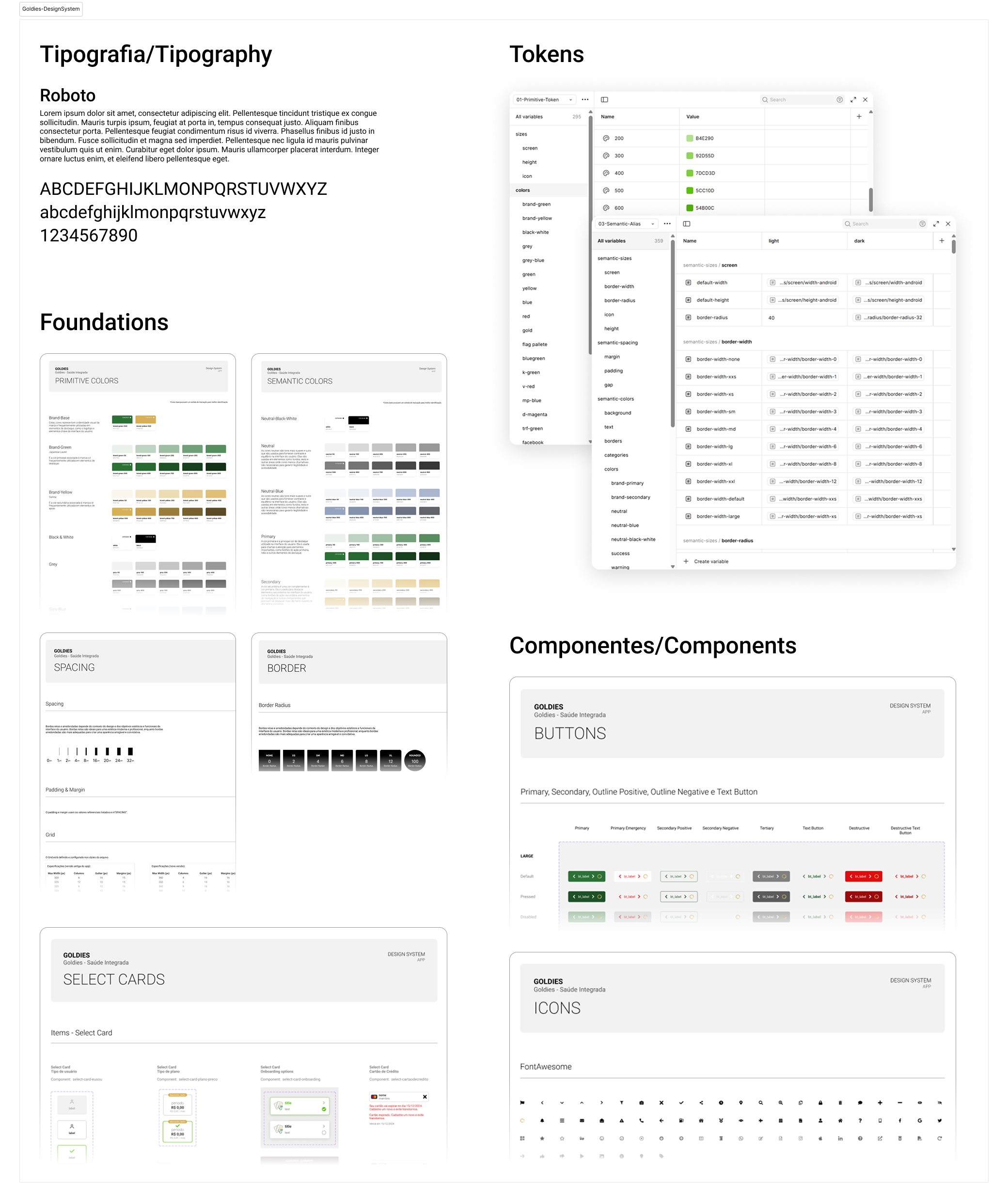
Design System
I developed a design system for the Goldies app due to its complexity and large number of screens. This ensured brand consistency, efficiency, and scalability for future expansion. It also improved team collaboration, maintained accessibility — making the product inclusive for users with different needs — and allowed for more strategic decision-making by focusing on overall user experience rather than visual details alone.
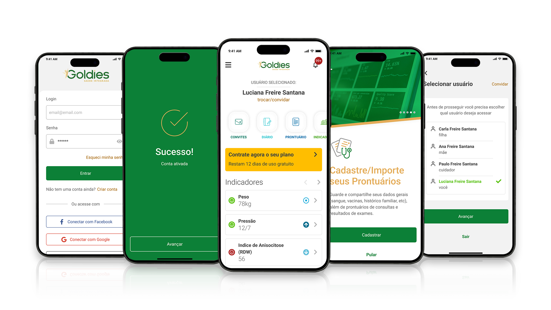
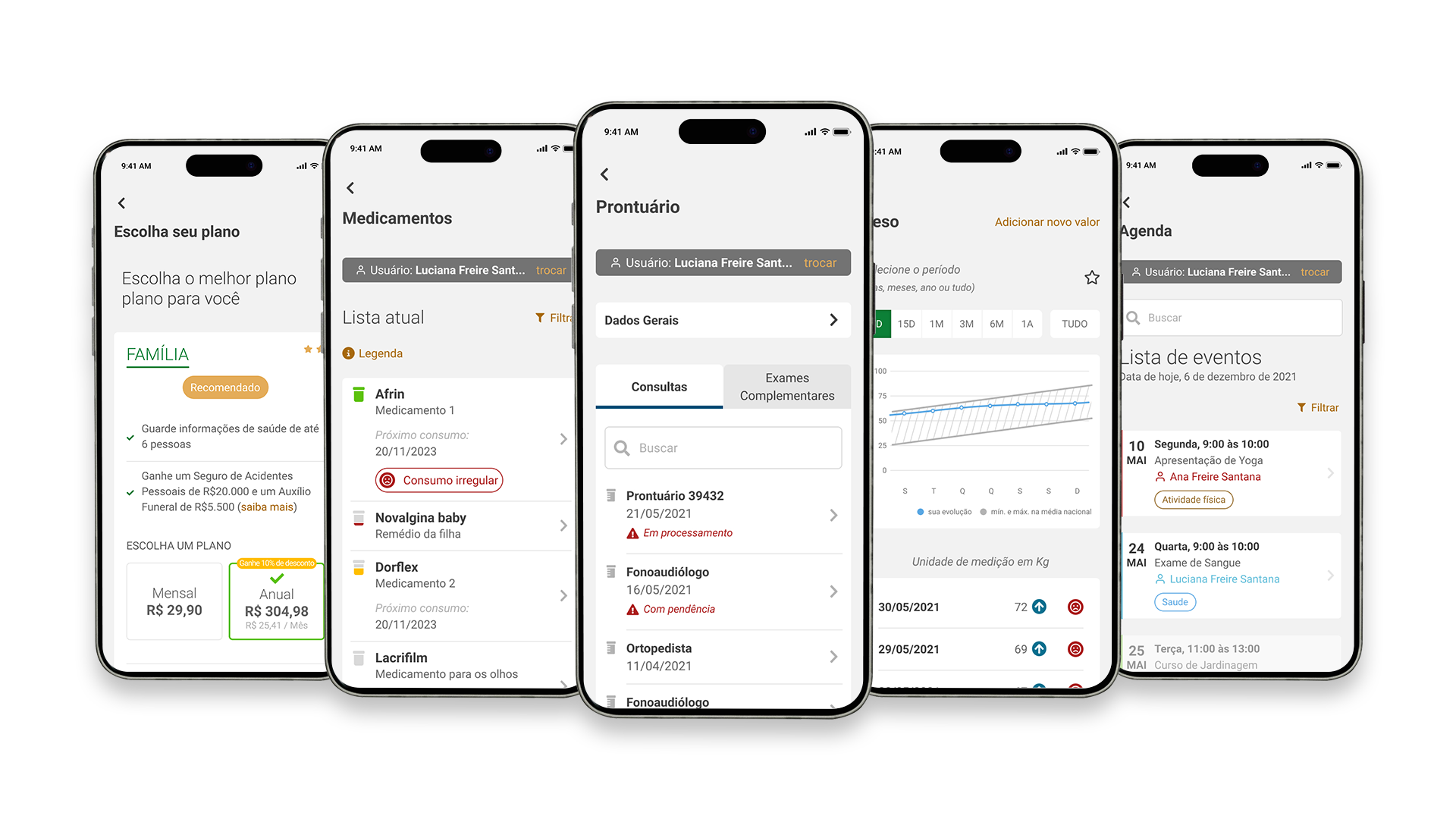
UI Design
Testimonials
“My mother takes many exams. It used to be hard to find them when needed or compare results to see if her health was improving. But with the Goldies app, everything changed! It’s super intuitive — I can easily upload new exams, and the app organizes everything into charts and alerts me when something’s off. I recommend it to anyone who wants to care for their parents with more safety and convenience.”“
Silvana Moreira, 55 years old
Rio de Janeiro, RJ
““Goldies was a revolution in my work! It used to be hard to keep everything organized, but now I have quick access to the elderly person’s information and can share it easily with the family. It’s an indispensable tool for anyone working with senior care.”“
Tatiane Paula, 32 years old (caregiver)
Salvador, BA
““At first, I thought the app would be complicated to use, but it’s so simple that even I can handle it! My daughters feel more at ease because they can see everything on their phones and join me at appointments when possible. Goldies greatly improved our communication and made me feel more independent.”“
Antônio, 72 anos
Belo Horizonte, MG